Through the use of satellites the public has been able put a images and color to the planets in our solar system. NASA has launched many satellites and with them have captured photographs of all nine planets. These photographs have been the defining images of the planets so from this research we are able to know more about the other planets in our solar system.
Mercury has a very similar look to Earth's moon. It has a grey rocky surface and does not appear to have any sort of color in its atmosphere.
Venus has thick clouds that block any satellite to get a look at the planets surface. These sulfuric acid clouds are yellowish in color mixed with some lighter hues of yellow as well as some white. Due to the sulfuric acid in the atmosphere the air and the surface of Venus has a reddish brown color. But scientists say if the atmosphere could be removed the planet would look more neutral grey.
Mars an arid planet that has a reddish brown color due to iron build up in the surface. Due to Mars's atmosphere that creates strong winds the surface dust is moved around making the whole planet have more of a red hue.
Jupiter's swirling colors comes from the multiple gases it is made up of. Orange and white are the prominent colors in the planets atmosphere and they are created by ammonia and ammonium hydrosulfide.
Saturn's is also made up of hydrogen and helium gases like Jupiter, however, small amounts sulfur give the planet a yellows look. The haziness that is noticable with Saturn is attributed to the addition of nitrogen and oxygen gases mixing with hydrogen.
Uranus is the least massive of the giant planets. Like the other giants its atmospheric make up is helium and hydrogen gasses. The planet appears as a pale cyan and the edges lower in value. Uranus is probably one of my favorite planets due to its pale blue color.
http://www.aerospaceweb.org/question/astronomy/q0264.shtml
Thursday, March 27, 2008

I smell spring
I have always been fascinated with the changing of seasons. Every year it happens but one of the biggest noticeable changes is the transformation of leaves. I did some research on how this transformation works, and why. Although researchers have been studying leaves and their color changes for a long time there is still not a full understanding of the process. Scientists have agreed on some of the factors that affect the leaves change, some being, leaf pigment, type of tree, weather, and the length of night.
In creating autumn colors there are three pigments that trees use to create what we see the fall season.
1. Chlorophyll- green
2. Carotenoids- yellow, orange, and brown
3. Anthocyanins- red, and purple
Plants and trees use chlorophyll to capture sunlight and use that sunlight for photosynthesis. During growing season/Spring there is more sunlight and that abundance of chlorophyll is what makes the plants so green. Once plants start getting less light during the day the chlorophyll content recedes and the other pigments become more evident. All trees have different characteristics and each one has certain colors that its leaves change to each fall.
Oak- red and brown
Dogwood- purplish red
Red maple- bright scarlet
Black maple- bright yellow
Aspen- golden yellow
Birch- golden yellow


http://www.na.fs.fed.us/spfo/pubs/fs/colors/colors.htm
In creating autumn colors there are three pigments that trees use to create what we see the fall season.
1. Chlorophyll- green
2. Carotenoids- yellow, orange, and brown
3. Anthocyanins- red, and purple
Plants and trees use chlorophyll to capture sunlight and use that sunlight for photosynthesis. During growing season/Spring there is more sunlight and that abundance of chlorophyll is what makes the plants so green. Once plants start getting less light during the day the chlorophyll content recedes and the other pigments become more evident. All trees have different characteristics and each one has certain colors that its leaves change to each fall.
Oak- red and brown
Dogwood- purplish red
Red maple- bright scarlet
Black maple- bright yellow
Aspen- golden yellow
Birch- golden yellow


http://www.na.fs.fed.us/spfo/pubs/fs/colors/colors.htm
Thursday, March 13, 2008
We had a choice


There were a few people in my class that already learned many of the color techniques being taught. Bart, Paulette, Sharon, and myself all went to the professor and proposed different ideas for more alternative activities for learning the different aspects of color. After she read over our ideas the four of us voted one what we wanted to do most. Sharon's idea of painting everyone in the three different color schemes won the vote. The first area our group decided on was to use the color red for the three different areas. Once our group sat and divided who would do what we decided on the materials we would need to acquire for our activity. Bart was assigned analogous colors of red, I was assigned
monochromatic colors of red, and Sharon and Paulette were assigned complementary colors of red. We painted Bart first and because analogous do not have to be painted in in sort of order we decided to paint Bart with random shapes and in random places over his upper body. Sharon and Paulette were painted next and each one of them had one half of the scale on their arms. One of the creative parts of complementary painting was that when Sharon and Paulette put their fists together the scale flows from arm to arm. Sharon and Paulette planned out a pattern on my back. The basic shapes of my ribs and spine were painted in monochromatic colors of red. Bart and I documented all of the painting and final product by taking pictures and Sharon and Paulette wrote a statement about our activity. All four of us we painted by the end of class presented ourselves to our professor. After that we presented our activity to the class. Bart, Sharon, Paulette, and I all enjoyed working together on this project. Each one of us was painted and each took part in painting. The four of us worked well together in creating an interesting spin on the traditional color schemes.

Thursday, February 28, 2008
MONO+COMP+ANALOGOUS
Similar to the color wheel this color mixing project involved good craft. It involed a clean finished product. I enjoy the feeling of having a beautiful finish piece no matter how annoying or time consuming the activity might be. When I first sat and started the color mixing project I was thinking about how unimportant it was for me to paint these rectangles. Once I finished the first row (monochromatic), I found that I was becoming much faster at mixing the colors. Once I was able to get the colors faster painting did not become such a dreadful task. It took some time but after working with the medium for a while I was able to enjoy the assignment more. I was happy with my end result. There was a great improvements in my color mixing after completing the activity.
Sunday, February 24, 2008
Color Wheel!!!!
I was able to finish the primary colors of my color wheel in class. The color wheel is a classic way to get to know and understand color, but because it is such a common start to understanding color I found this assignment boring. I have made many other color wheels in my art career and painting another one was monotonous.The one thing I did like about creating this color wheel though was its precise lines and the emphasis on the perfect gradation of color. All the color wheels I have made in the past have been a simple, quick attempt and this is the first that I truly tried to make the perfect color. I am a bit of a perfectionist and this structure for the assignment appealed to me greatly.The type of color wheel that our class painted is called Munsell color system. This system deals with hue, value, and color purity. Hue is another name for pure color. A hue does not have any tint or shade to change its appearance. Value is where a color sits on the scale of light and dark. Color purity is the saturation of the color. These three elements make up the Munsell color wheel. Again, I have painted color wheels before so the generel assignment was lack luster, but the way it was carried out was a better way to teach basic color.
Wednesday, February 13, 2008
Learning Color
Color means more to me than it did before college. I like color now.
I took an oil painting class last year and that 6 week class opened the world of color for me. Ever since I took that class I have seen color in a different way. I notice color more frequently in my day to day life. When I first started to go to museums and was interested in paintings and the technique, I found that I was loving color more and more. All the paintings I saw had such interesting combinations of color, and because I have been a photographer for a couple of years now, there was a time where I ignored color, due to my love of black and white photographs.
Once I started learning art history in first semester of college I realized the vast world of color, and how necessary color can be in art. College has exposed me to new colors and a new way of thinking about color. I feel like I am learning how color works with paint, light, and everyday items. Through this class(Visual Concepts), I have learned to mix colors and to experiment with the combination of them. Through some minor design work, studying color photographs, and being exposed to more art I have developed a greater understanding of color.
Monday, January 28, 2008
Color Context
 Color changes the way we perceive objects. Corporate companies know this and use it to their advantage. A couple examples: the color red is used to catch attention (stop signs, bike reflectors) and the color green is used to represent calmness, nature, healthy things.
 The picture to the left shows Johnson's baby lotion. The bottle was made pink probably because the company wanted to portray a feeling of softness and comfort. Pink also reminds me of baby items due to its strong reference in girl baby clothing. Companies think of all these things when creating a product and deciding its color.
 In the second picture each gift card has different colors that have been assigned to a company. Each company has chosen colors that would best represent its motive. The cards shown are cell phone minute cards. Most cell phone companies have chosen bright colors to catch the attention of their customers. Repeating colors are also used to get customers to relate those colors with that company.
 Color has everything to do with product design and is an important part of how we as customers perceive things.
Friday, November 30, 2007
Bromley Mission School

On November 7th I went to Liberia with a few churches from northern Virginia. On the mission trip our group brought school supplies, clothing, food, and improved facilities to Bromley Mission School. The school is a girls boarding school and has about 187 students. I enjoyed my trip greatly, and appreciated meeting and spending time with the girls. You can see photos of my trip here
Friday, November 2, 2007
Smoking, Wrestling, and High Fives
 I participated in two performances today as well as help instruct my own. The first performance I did was Jake's. His activity was for me and a partner (Jill) to go through the steps of smoking a cigarette. Jake wrote out each step from lighting to the disposal. I enjoyed this activity even though it was simple.
 The next performance I was involved in was Thiana's. Her performance piece involved two partners linking arms. After linking each person had to pull as hard as they could until one of the participants gave up. This activity was

about strength and was more of a competition. My partner was Chul for this performance which was a good match I thought, and the whole experience was fun but eventually came to a draw.
My interactive performance required two people to perform. The partners had to stand about 10 feet apart and walk towards each other to give a high five. Once the first high five was given the two participants had to follow through and low five behind the back. This results in a continuous motion of high fives. This motion was to be repeated until perfected. I thought my performance worked for the assignment and was performed correctly.
The interactive performances were a new form of art that I have not experimented with before. This class activity not only made class interesting but gave me a better sense of what the artists were doing in that time.
Fluxus
Fluxus is a network of artists and designers known for using multiple types of media and using new or different ways of making art. Fluxus got its start in the mid to late 1950's from the experimental music of John Cage. George Maciunas was influenced by John Cage's ideas, especially in the idea of chance in art. There was a class taught by Cage called Experimental Composition at the New School of Social Research in New York City. Fluxus was more interested in simplicity a do it yourself way of thinking. A popular type of Fluxus art is called Fluxkits. These kits were a combination of games, printed cards, and ideas that are then organized in a wooden box. This one type of art was created by George Maciunas. Later in the Fluxus movement many members started to explore poetry, performance pieces, and experimental music and film.
http://en.wikipedia.org/wiki/Fluxus
Introduction to Performance Art
The activity that we had to participate in was about a visual connection between two people. Thiana and I both had mirrors that we held in front of our faces and looked back at each other. I had to make a funny face and Thiana had to repeat the face. After she repeated the face I made we both had to take a step away from each other. We became farther and farther away from each other and it became harder to see each others faces. This performance piece was a simple but fun introduction to performance art.
Thursday, October 11, 2007
Logos
 Olympic Games Logo
I think that this logo is a great logo for such an event. It is simple and recognizable at a glance, both important in a logo. This logo also has meaning. The circles color represent the five parts of the world that participate in Olympic Games. The interlocking rings represent those five parts coming together to play in such an event.
www.savetibet.org/news/newsitem.php?id=908,
February 7, 2006
The Bride Stripped Bare by her Bachelors, Even
 This work of art is so complex and amazed me how much of a story Duchamp put into it. I do like the abstractness of the piece and how that juxtaposes how the piece has such a deep story. When I first saw the mechanical structure at the bottom of the piece I was confused and unsure of its meaning. After reading the notes that Duchamp wrote I started to understand the basics of his thought process but still found his ideas to be confusing. Marcel Duchamp has a great imagination to think of such a machine. When studying the top of the piece, I found the three squares and the shape surrounding them very interesting. The shapes and composition of the piece I like a lot and think work well as a complete work. It was only once I looked at the notes that I realized the sexuality of "The Bride". I find this to be interesting but not completely necessary. Even though this work has so much personal meaning to Duchamp I think that people can enjoy it without know the back story. Overall I enjoy The Bride Stripped Bare by her Bachelors, Even. The composition flows and the colors work as great piece of abstract art.
Thursday, October 4, 2007
Patterns
A pattern can be described as a repeating shape or decretive design. Patterns are found on all types of materials including fabric, tile, wallpaper, and even sides of buildings. Islamic art has great examples of pattern. Throughout their architecture intricate patterns are painted on the buildings. Islamic patterns are very colorful and have small details that make the patterns interesting. In tile patterns there are a lot of geometric shapes. In fabric patterns there is a majority of wavy or more organic designs. Wallpaper or wall designs tend to have a lot of line patterns. Islamic architecture is the most interesting to me. The intricate patterns show how much time and thought was put in to each building.
Wednesday, September 26, 2007

Tuesday, September 18, 2007
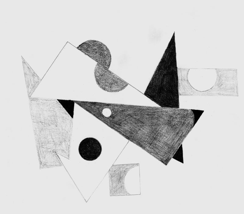
Value Scale
Making the value scale was not a hard task for me to do. I have made many value scales before and another seemed completely unnecessary. But once I started I found that I enjoyed doing this exercise. The reason I liked this one more than usual was that I was able to put the scale in my own design. Allowing the class that freedom made the assignment more interesting for everyone.
Thursday, September 13, 2007
String
The string activity was a fun. I vaguely understood the purpose of the activity though. I liked getting wrapped up with the string but I also did not understand the purpose. I think that if I did the project again I would wrap other things and not myself. I greatly regretted tangling myself once I had to undo all the knots.
I also liked drawing exercise. It was interesting to think about what line and shape really were.
Line > Shape

Images B and C are lines. Images A and D are shapes. A line is a mark definite ending point. A shape is made up of lines that connect into a form.
Wednesday, September 5, 2007
Number One

In this piece of work, there are many circles and curly designs through out the work. There is an overall cool tone to this work. In the center there black circle that is a main focal point. Above the focal point there is a red semi circle and many other overlapping circles next to that. The black filigree in the foreground come vertically down the artwork like they are hanging.
I think that this piece has a strong graphic design style. The black filigree designs resemble chandeliers and the circles have a doily designs in the center. I think that there is a fun mood but it also looks delicate. Both the filigree and doily elements give a intricate look to the whole piece. The whole design resembles a colleague with each element overlapping.
This piece of artwork has a great composition. With the red at the top and the black filigree hanging down, the whole piece has a great sense of balance. All the colors in this piece of artwork very well together. I like the cool tones with the bursts of vibrant color. The whole piece is very interesting, especially with the patterns inside each circle. I like this piece a lot, and really enjoy how every element works together.
Subscribe to:
Posts (Atom)